
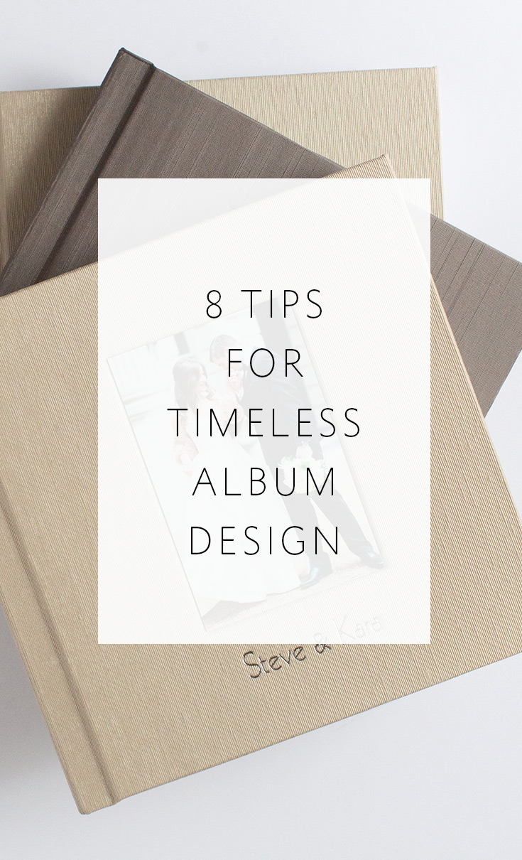
8 Tips for Timeless Album Design
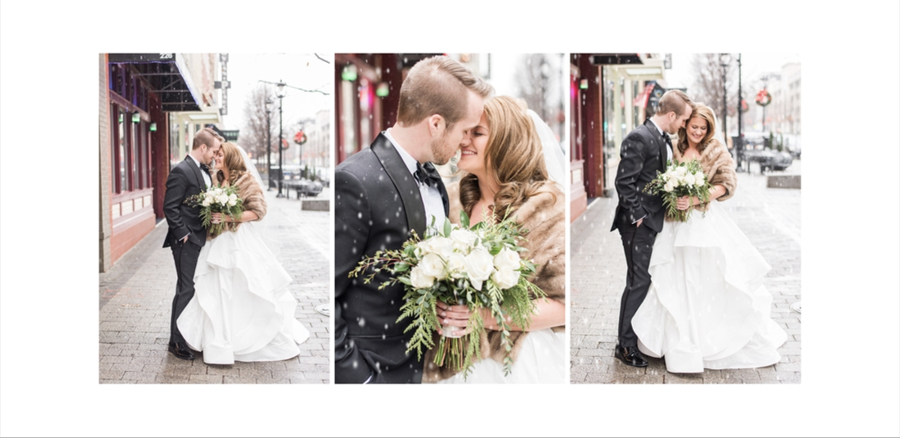
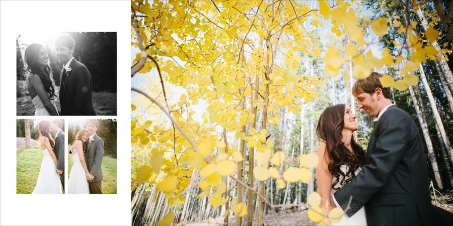
above images by Megan Travis Photography
Hey guys! Melissa Jill here! I remember the first album I designed myself. It was 2004 and my client had asked for an album. I had never even created a sample album at that point so EVERYTHING was new to me. But I figured, how hard could it be? I'll just whip one up. Haha! Poor little naive me. Three months, ten headaches, and a dozen workflow issues later, I had my first album done. It turned out to be much more challenging than I had initially anticipated. And being that I was new to albums, I was dealing with a HUGE learning curve. Since then I have learned so much about the album design and sales process, and that's one of the main reasons I'm sharing this series of tips -- to help others who may be facing this learning curve for the first time themselves.
I remember looking back at that very first album years later in my client's home and cringing at a few of my choices. Namely, I thought it would be fun to make a collage of overlapping and tilted images for a reception spread. You know...because receptions are wild and crazy, the design should be as well? Yikes! Major regret on that design choice. There were a number of other design trends that I succumbed to in that first design that are SO entirely outdated now. Which makes me sad, because wedding albums need to last generations without looking outdated. Of all things, a wedding album should be timeless.
Today I'm going to share some timeless design tips that we at Align adhere to, and that I would recommend to any of you out there who are designing your albums in house. I hope I don't step on any toes or hurt any feelings, but there are also a few outdated trends that I'd like to call out as well. I learned my lesson the hard way by regretting my design choices, and I want to encourage you all to keep your designs clean and timeless so you don't experience this same sense of regret years from now.
So let's start by ripping the bandaid off first. The outdated trends to steer clear of are:
1. Using images as backgrounds
2. Making images opaque
3. Excessive overlapping of images
All of these trends clutter up your design and don't allow your images to stand apart and be appreciated as art. Your images themselves are interesting. You don't need to make your design overly complex to create a beautiful album. Let the images shine and tell the story for you. As a side note, even though we don't recommend any of the above design choices as being ideal, Align can absolutely design albums with these specifications. The most important thing to us is that you and your clients are happy. And we strive to customize our designs to fit your unique preferences. Just select the "Styled" design option and put your preferences in the comments section of your order form.
Now for the positive tips. Here is what TO DO if you want your albums to be beautiful and remain timeless for generations to come.
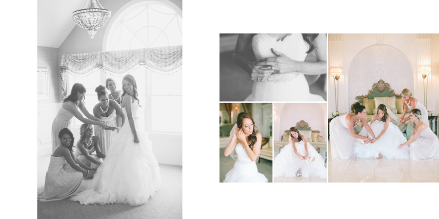
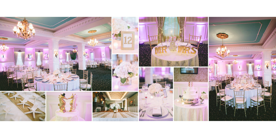
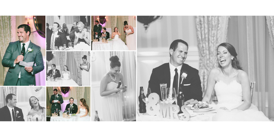
#1 -- Use restraint and don't clutter up your spreads with too many images. The fewer images per spread, the more importance you give them.
Hey guys! Melissa Jill here! I remember the first album I designed myself. It was 2004 and my client had asked for an album. I had never even created a sample album at that point so EVERYTHING was new to me. But I figured, how hard could it be? I'll just whip one up. Haha! Poor little naive me. Three months, ten headaches, and a dozen workflow issues later, I had my first album done. It turned out to be much more challenging than I had initially anticipated. And being that I was new to albums, I was dealing with a HUGE learning curve. Since then I have learned so much about the album design and sales process, and that's one of the main reasons I'm sharing this series of tips -- to help others who may be facing this learning curve for the first time themselves.
I remember looking back at that very first album years later in my client's home and cringing at a few of my choices. Namely, I thought it would be fun to make a collage of overlapping and tilted images for a reception spread. You know...because receptions are wild and crazy, the design should be as well? Yikes! Major regret on that design choice. There were a number of other design trends that I succumbed to in that first design that are SO entirely outdated now. Which makes me sad, because wedding albums need to last generations without looking outdated. Of all things, a wedding album should be timeless.
Today I'm going to share some timeless design tips that we at Align adhere to, and that I would recommend to any of you out there who are designing your albums in house. I hope I don't step on any toes or hurt any feelings, but there are also a few outdated trends that I'd like to call out as well. I learned my lesson the hard way by regretting my design choices, and I want to encourage you all to keep your designs clean and timeless so you don't experience this same sense of regret years from now.
So let's start by ripping the bandaid off first. The outdated trends to steer clear of are:
1. Using images as backgrounds
2. Making images opaque
3. Excessive overlapping of images
All of these trends clutter up your design and don't allow your images to stand apart and be appreciated as art. Your images themselves are interesting. You don't need to make your design overly complex to create a beautiful album. Let the images shine and tell the story for you. As a side note, even though we don't recommend any of the above design choices as being ideal, Align can absolutely design albums with these specifications. The most important thing to us is that you and your clients are happy. And we strive to customize our designs to fit your unique preferences. Just select the "Styled" design option and put your preferences in the comments section of your order form.
Now for the positive tips. Here is what TO DO if you want your albums to be beautiful and remain timeless for generations to come.
#1 -- Use restraint and don't clutter up your spreads with too many images. The fewer images per spread, the more importance you give them.
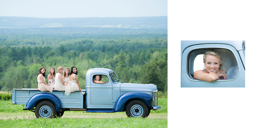
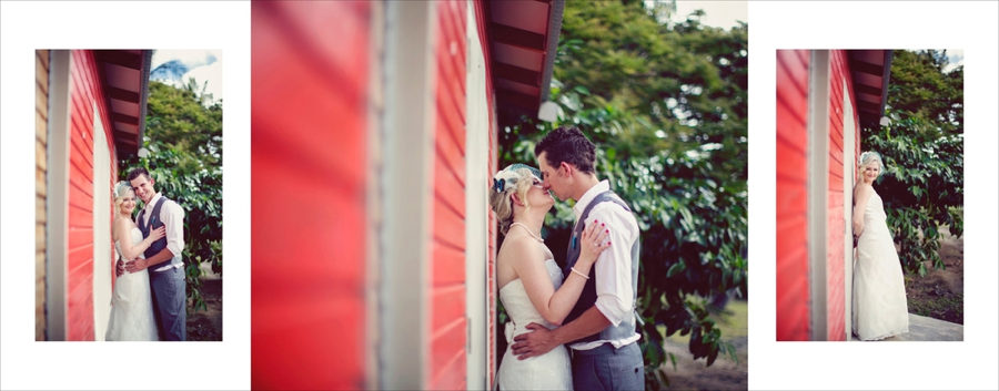
above images by Candace Berry Photography
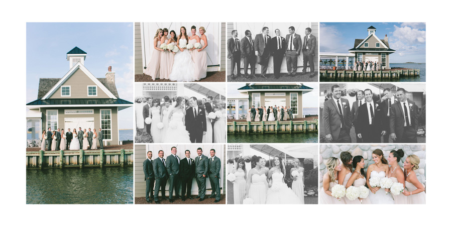
#2 -- If you do use a lot of images on a given page, make sure to use a structured layout that makes it easy for your eye to "read" what is going on.
#2 -- If you do use a lot of images on a given page, make sure to use a structured layout that makes it easy for your eye to "read" what is going on.
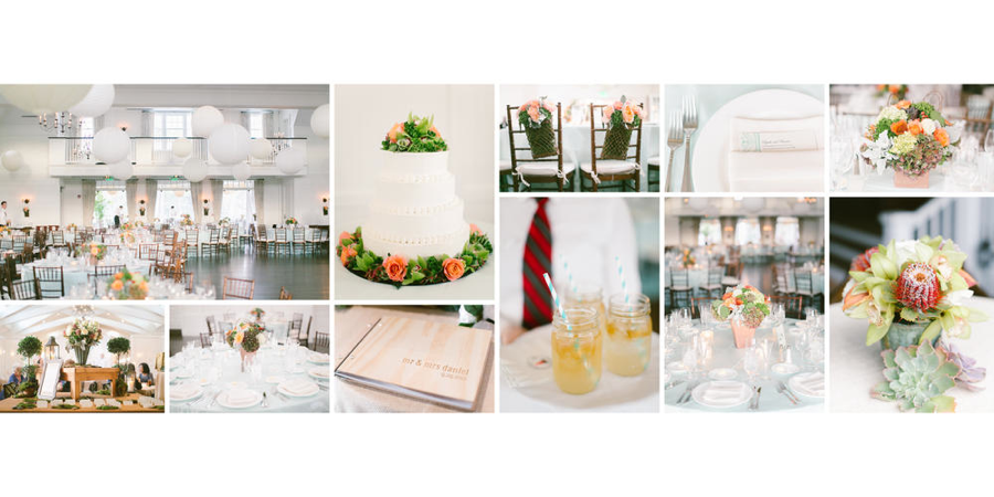
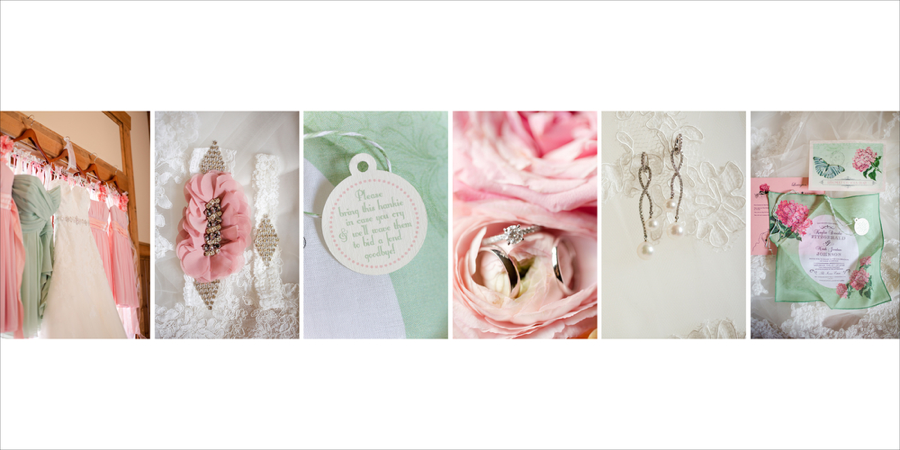
above images by Maggie Harkov Photography
#3 -- We prefer white backgrounds, but if you'd like to use some color on your album spreads, makes sure to pull the color from the photographs that are used on the spread to keep everything cohesive.
#3 -- We prefer white backgrounds, but if you'd like to use some color on your album spreads, makes sure to pull the color from the photographs that are used on the spread to keep everything cohesive.

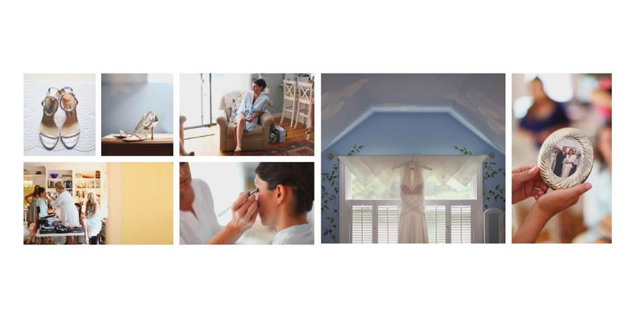
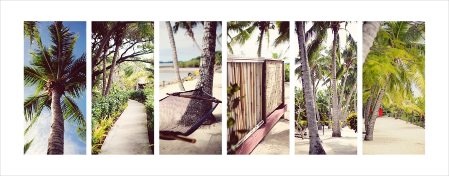
above images by Amelia Soper Photography
#4 -- Much like matting for a framed photo, using negative space is a great way to draw attention and importance to an image. Don't feel the need to fill every white space.
#4 -- Much like matting for a framed photo, using negative space is a great way to draw attention and importance to an image. Don't feel the need to fill every white space.
above images by Hello Love Photography
#5 -- Make your favorite image the focal point of the spread. Duh, the best images should be given the most real estate.
#5 -- Make your favorite image the focal point of the spread. Duh, the best images should be given the most real estate.
above images by Megan Alvarez Photography
#6 -- Group your images by location so that each spread tells a cohesive story. This is a great thing to keep in mind when you are shooting too. Taking a number of different photos in each location will make for a great album design!
#6 -- Group your images by location so that each spread tells a cohesive story. This is a great thing to keep in mind when you are shooting too. Taking a number of different photos in each location will make for a great album design!
above images by Leezett Photography
#7 -- Think about the color story you are telling on each spread. If there is too much going on color-wise, think about separating competing images onto separate spreads, or putting some of the images in black and white.
#7 -- Think about the color story you are telling on each spread. If there is too much going on color-wise, think about separating competing images onto separate spreads, or putting some of the images in black and white.
above images by Katelyn James Photography
#8 -- Help your design to tell a story by including a number of scene-setting spreads that set the scene for what is to come. This is another great tip to keep in mind for when you are shooting! It's not only wedding detail photographs that help make a design beautiful, think about how you can take detail shots of the location and venue to help tell the story of the day.
#8 -- Help your design to tell a story by including a number of scene-setting spreads that set the scene for what is to come. This is another great tip to keep in mind for when you are shooting! It's not only wedding detail photographs that help make a design beautiful, think about how you can take detail shots of the location and venue to help tell the story of the day.
above images by Leezett Photography
I hope you've found these tips and examples helpful!
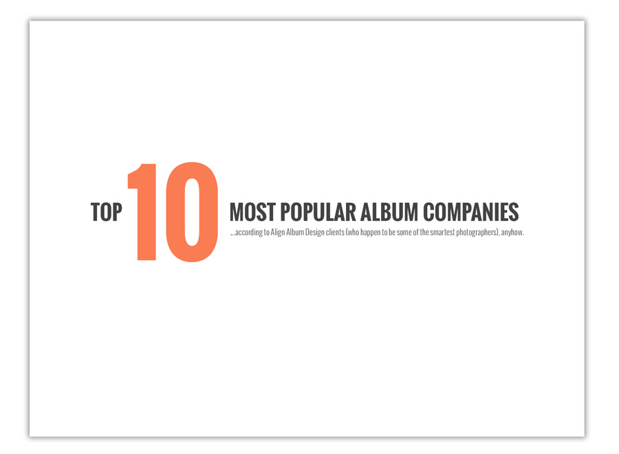
----------> If you are overwhelmed with design and want to give outsourcing a try, click here to find out more about the design styles that Align offers. We have 3 standard design styles but can definitely customize to meet most needs, so don't hesitate to send us examples of designs you like and let us know what your preferences are, and we will design to those specifications. After you take a look at our design styles to find out which one would work best for you, click here to sign up for an account with Align. When you do so, we'll send you a free welcome gift -- our "Top 10 Most Popular Album Companies" Resource List. That way you can find out which album printing & binding companies are the most popular among photographers who use Align, and more importantly, WHY.
I hope you've found these tips and examples helpful!
----------> If you are overwhelmed with design and want to give outsourcing a try, click here to find out more about the design styles that Align offers. We have 3 standard design styles but can definitely customize to meet most needs, so don't hesitate to send us examples of designs you like and let us know what your preferences are, and we will design to those specifications. After you take a look at our design styles to find out which one would work best for you, click here to sign up for an account with Align. When you do so, we'll send you a free welcome gift -- our "Top 10 Most Popular Album Companies" Resource List. That way you can find out which album printing & binding companies are the most popular among photographers who use Align, and more importantly, WHY.
If you already have an existing Align account and want a copy of this resource guide, you're welcome to email us for a copy.
-----------
Blog post written by: Melissa Jill
Blog post written by: Melissa Jill
New York Country Club Wedding by Maggie Harkov
Oooh such prettiness! We love this album design featuring a wedding shot by Maggie Harkov at the Westchester Country Club. Working with photographs of dapper-looking gentlemen, elegantly dressed ladies, gorgeous details, and golf course sunshine makes our job so gratifying! We are thrilled at how this album design turned out! Maggie Harkov is an extremely talented photographer based out of New York and you can view some of her previously featured albums here.
Here are some of our favorite spreads from this design:
Here are some of our favorite spreads from this design:


Flip through the whole album design below:
-----------
Design by: Andrea (View More) // Design style: Classic (View More) // Blog post written by: Denise
Design by: Andrea (View More) // Design style: Classic (View More) // Blog post written by: Denise
Yacht Club Wedding by Maggie Harkov Photography
Maggie Harkov is a talented photographer based out of New York City who we love to feature (as shown here and here). Maggie is taking time off from her photography business because she was recently blessed with an adorable baby boy! Because we miss her, we thought featuring one of her albums on the blog today could give us the little Maggie boost we needed! Check out this album design featuring a romanic wedding at a yacht club in New Jersey.
Here are some of my favorite spreads:
Here are some of my favorite spreads:
Click through the slideshow below to see the full design:
-----------
Design by: Andrea (View More) // Design style: Classic (View More) // Blog post written by: Denise
Design by: Andrea (View More) // Design style: Classic (View More) // Blog post written by: Denise
White Church Wedding by Maggie Harkov Photography
I'm smitten with this recent design and can't wait to share it with you! Maggie Harkov is a crazy-amazing photographer based out of New York City who specializes in weddings. There are so many things I love about this design and this wedding -- the colors, the perfect white church, and the amazing details to name a few. I couldn't bring myself to pick just one favorite spread, so you get four:


Gorgeous work Maggie!! We're so honored to work with you!
Click through the slideshow below to view the whole album:
Click through the slideshow below to view the whole album:
-----------
Design by: Andrea (View More) // Design style: Classic (View More) // Blog post written by: Melissa Jill
Design by: Andrea (View More) // Design style: Classic (View More) // Blog post written by: Melissa Jill
New York City Wedding by Maggie Harkov Photography
The combination of NYC photographer Maggie Harkov's amazing photography, this gorgeous couple, and the iconic Manhattan scenes portrayed throughout this wedding make this album design captivating. I love it so much! You'll notice this design utilizes the recurring theme of a horizontal film-strip layout with minimal spacing between images. Maggie is very specific in what she loves in an album design, and we are all too happy to accommodate! At Align, we offer three design styles, but we also note any preferences of individual clients and customize accordingly. In this case, the resulting design, well....see for yourself!
This is one of my favorite spreads from this design -- it screams New York fabulousness:
This is one of my favorite spreads from this design -- it screams New York fabulousness:

Click below to see the design in full. Gorgeous work Maggie!! We're so honored to work with you!
-----------
Design by: Andrea (View More) // Design style: Classic (View More) // Blog post written by: Melissa Jill
Design by: Andrea (View More) // Design style: Classic (View More) // Blog post written by: Melissa Jill